
Headspace

About Headspace
Headspace aims to teach the world to meditate, so that everyone can live a happier, healthier, more enjoyable life. The app is known for its animations and voice-overs by its CEO, Andy.
Design Goal
This app has one of my favorite visual designs and brands within the health tech space. I wanted to explore its usability to increase engagement and spread the benefits of meditation.
My Role
I was the sole designer for this unsolicited design study and completed over 5 days.
Quick Synopsis
Improving A Mobile App Onboarding Flow

I started with some market research to see what feedback has been provided about Headspace today. These gave me small insights into potential pain points that would arise in usability testing.
I conducted guerilla usability testing with 7 users and found significant pain points.
For each design decision, I rapidly prototyped different solutions and made certain assumptions to select a solution to start.
As next steps, I would test these solutions against my riskiest assumptions.
Research
What do people say about Headspace today?
Headspace has been around since 2010 and gone through a couple versions. The version released in 2014 shows a clear brand, and includes features based on two years of user feedback. This article provides details. I agree with the reviews.

“At first you’ll probably become irked that these clips are preventing you from starting the lesson - and thus not exactly helping relieve stress...One negative is that you have to sign-up to the programme with your email before you can start using it...”
persona Development
I conducted guerilla usability tests as a form of evaluative product experiment. Starting with a persona gave me a direction for the types of people I should interview for user research. I kept the discussion guide simple with only 3 quick tasks.
Usability Test Tasks
- Begin your first meditation break.
- Suppose someone interrupts you and you have to pause your meditation. Your phone goes to screensaver mode. Continue the session where you left off.
- Schedule time to meditate tomorrow at 2PM.
Guerilla Usability testing
Each user provided a lot of comments. In fact, some started to do the typical feedback thing of "well, it'd be great if you added this feature."
I made sure to not be distracted by those comments and stay focused on extracting their feelings, behaviors, and reactions.
Grouped by user - each color represents a different user
Some common themes arose:
- Audio issues - people were not always in an environment to clearly hear the animation
- Tour concerns - too long, not sure if they could get out of it
- Take 10 home screen - visual indicators unclear
- Reminders - limited settings and no confirmation
Grouped by common pain points
“It’s not a toolbox - you have to go through each one and feels more regimented. It also feels like a commitment, and I wouldn’t do that. ”
Approach
Design Decisions
On the Headspace site, they proclaim "When this simple activity is considered no more strange than taking a shower, we'll have achieved our aim." BJ Fogg's Behavior Model comes to mind when talking about simplicity. Where I think Headspace breaks in the hook model is their ability to have the user take a simple action. I focused on these key design decisions:
- How might we present immediate value to the user?
- How might we enable users to remember when to meditate?
- How might we teach users how to meditate without introducing too much friction?
Design
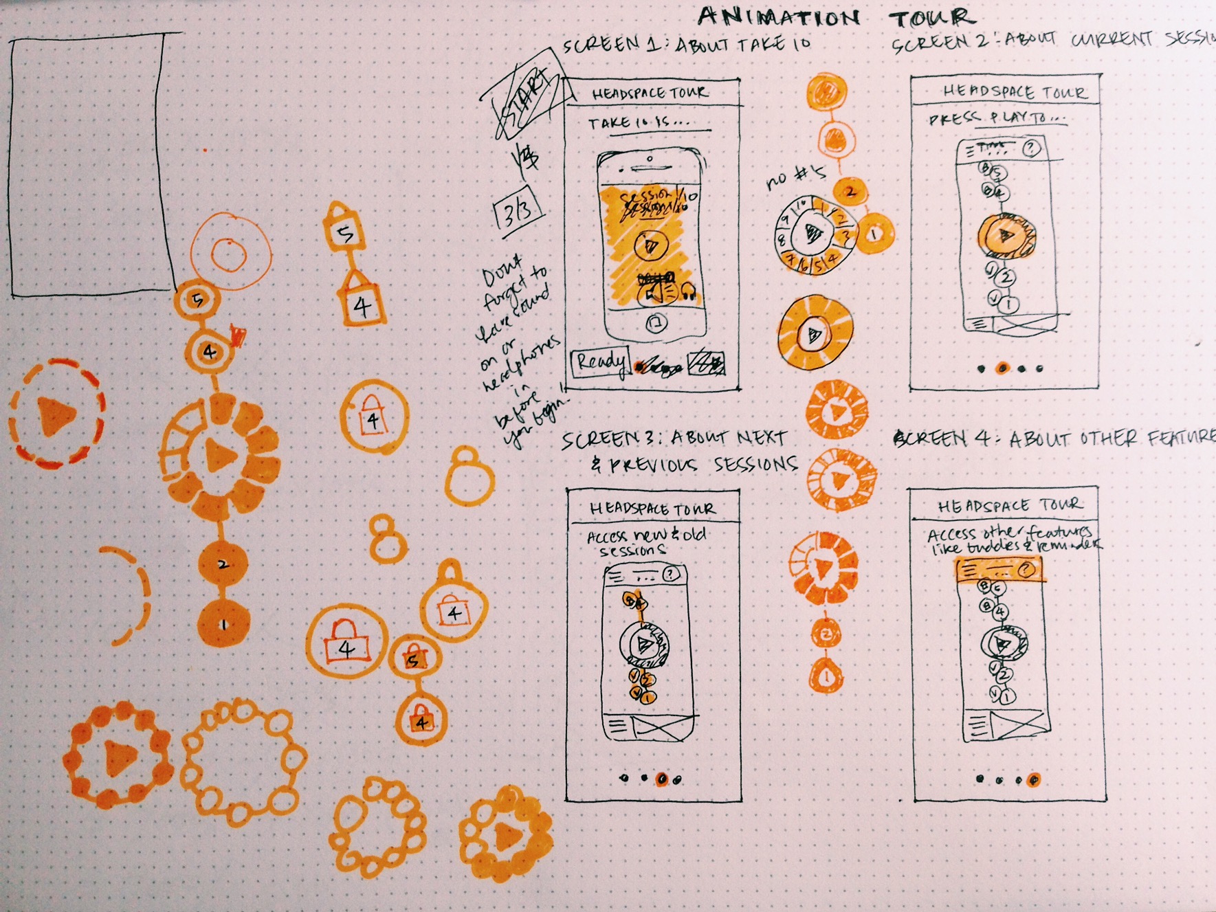
Onboarding Flow
Proposed Flow
- Removed the need to sign-up an account if you are just using their free Take 10 program.
- Removed the Headspace Tour because it refers to features that users don't immediately need to know about in order to meditate. They can view the tour later from the navigation menu.
- Removed "Swipe left and left again" screen because the visual indicator on the home screen should be intuitive enough that instructions aren't needed.
- Moved the Intro Video from the start of the first meditation session to the first thing people see upon opening the app. This eliminates catching people off guard in a meditation where they're expecting the session to start.
CUrrent Flow
My hypothesis was that removing the intro video and animation tour from the onboarding flow will increase the number of users that start the Take 10 program. This will need to be verified through evaluative experiments.
Other solutions included:
- Making the video shorter
- Having a guided interaction layer where the user would have tips telling them what to press while simulating an initial experience
I decided on taking out the video and tour because for the people I was testing with (busy professionals on-the-go), they had limited time, which was a big constraint.
Reminders
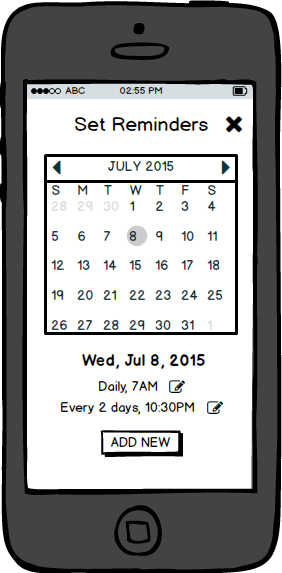


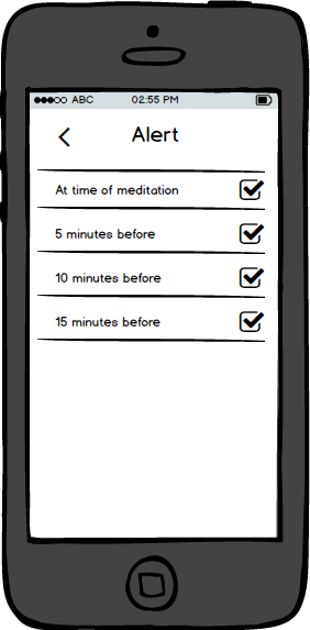

The feature I decided to add was the ability to schedule future meditations and set up reminders. This came out of the usability testing. Instinctively people went to the "Set Reminder" screen to try to set up recurring reminders, but did not find the capability robust enough for their needs.
I stuck with conventional patterns with regards to calendars and scheduling, and reviewed the iOS Human Interface Guidelines to make sure I aligned with them wherever possible.
Reminders: Before & After Prototypes

After (Clickable)
For the interaction design, I stayed consistent with the transitions that I saw throughout the rest of the app. For example, new screens typically opened sliding up and closed sliding down. As for the calendar settings, I followed the iOS HIG conventions that you see when interacting on iCal on mobile.
BEFORE
Users could only hit an on/off toggle and set a time for the reminder. This assumes that they want a daily reminder, and it does not provide any confirmation after making a change. The user feels lost as to whether their change was acknowledged.
Home Screen
Given I had more freedom to play around with different design patterns on the home screen re-design, I started simply with pen and paper vs. using a tool. This afforded me rapid prototyping at the start.
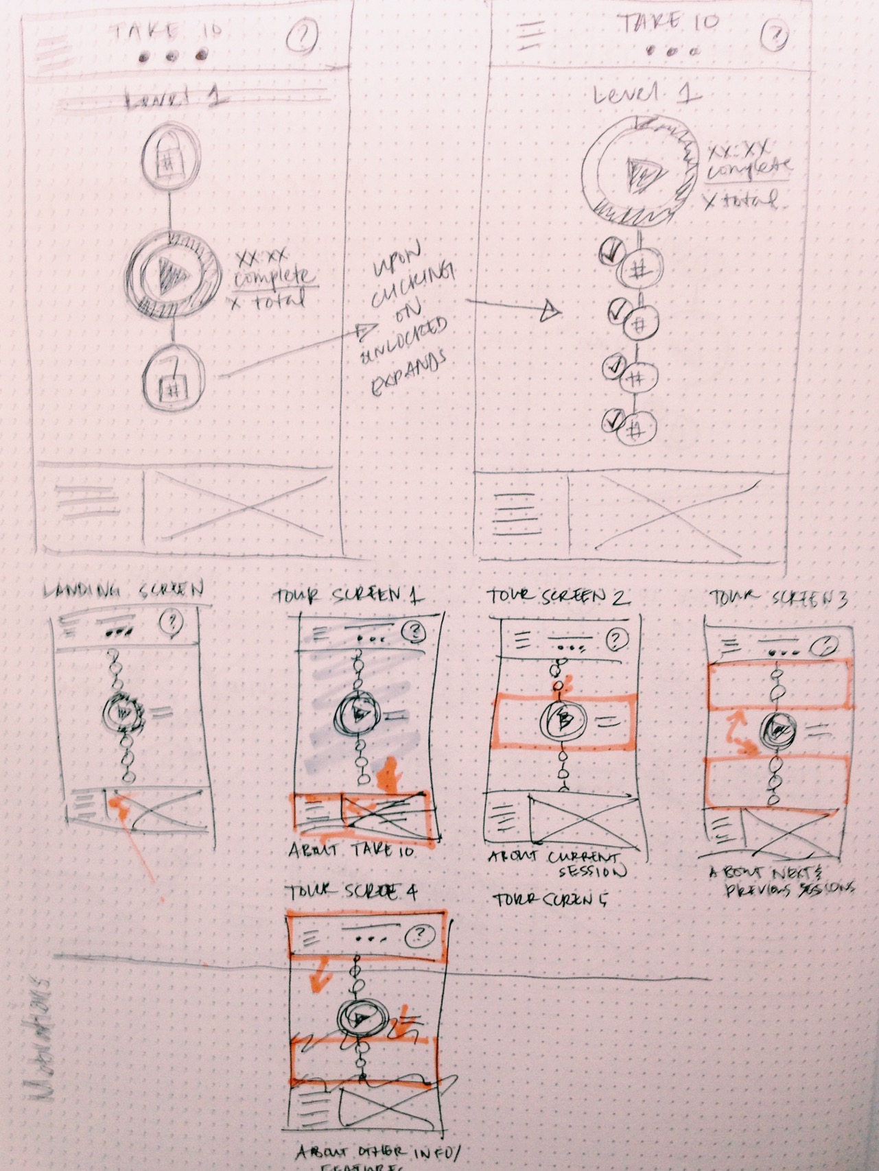
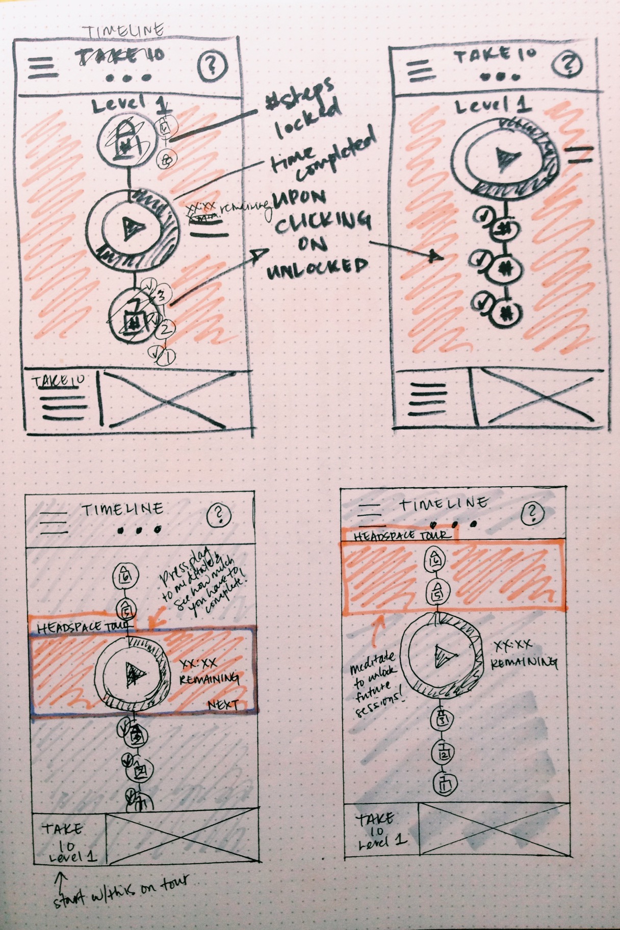
Home: Before & After Prototypes
Before

After
Other Changes
- Removed "Next Session" indicator and made currently available session more prominent with a larger play button
- Removed darker tone on the next session as that confused users
- Removed Take 10 gray circle and dot as that confused users
- Removed reference to headspace.com since people are not likely to open a browser window on their phone and remember to type in the site URL
Retrospective
Get Design Critique Often
One of the key learnings from this project was getting design feedback often and from different people. Each person peeled another layer off the onion to expose the most intuitive design. This is especially important for products that have a diverse target audience where there is not necessarily a single mental model to design for.
*This is a design exercise. I am not affiliated with Headspace in any way and this is not a reflection of Headspace's plans or views.