
Counsyl
About Counsyl
Counsyl provides genetic screens that enable people to make informed decisions about their health. Their Family Prep Screen looks at your saliva or blood sample against 100+ inherited diseases to help with family planning.
Design goal
Counsyl received user feedback that their order flow was confusing and it was leading to less than optimal conversion rates. They asked us to conduct more user research and re-design this flow.
My role
I worked with 4 other designers for 4 weeks to scope and execute the project. I conducted usability tests, rapidly prototyped, and presented in key client meetings.
Quick Synopsis
Re-designing a Genetic Screen Order Flow

We started with initial hypotheses around why users found the current order flow confusing. These drove what questions were included in our discussion guide.
We conducted on-site usability tests with 5 users and uncovered key insights that led to re-evaluation of the process flow, in particular segmenting the flow into pre-doctor authorization and post-doctor authorization. The premise was to only ask users for information when relevant.
After analyzing other health tech companies' form designs, and conducting multiple design studios, we rapidly prototyped multiple versions of order flow screens.
Our final high fidelity prototype incorporated Counsyl's design style and was implemented by the Counsyl design team for further validation. We hope to see increased conversion rates that validate the changes!
Research
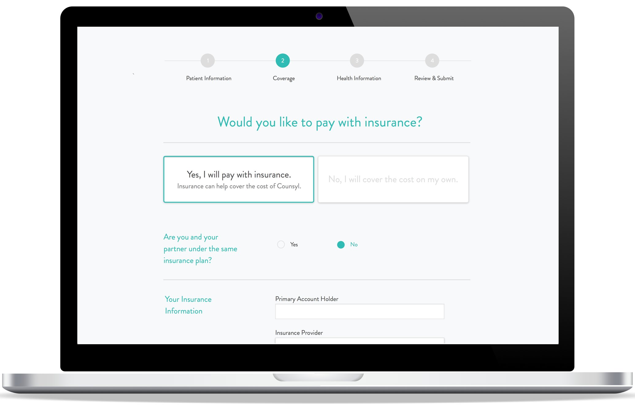
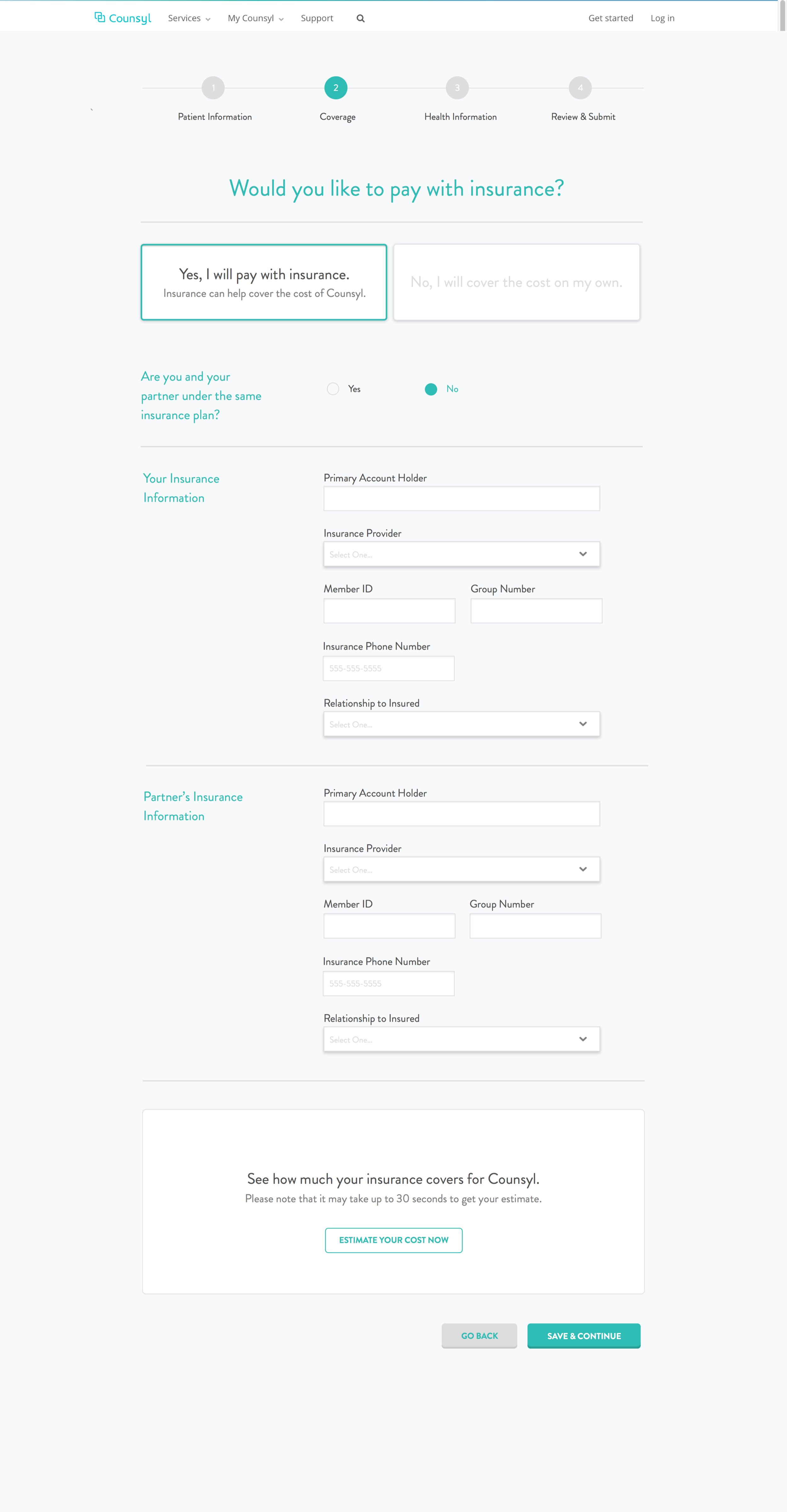
"Does my insurance cover this?"
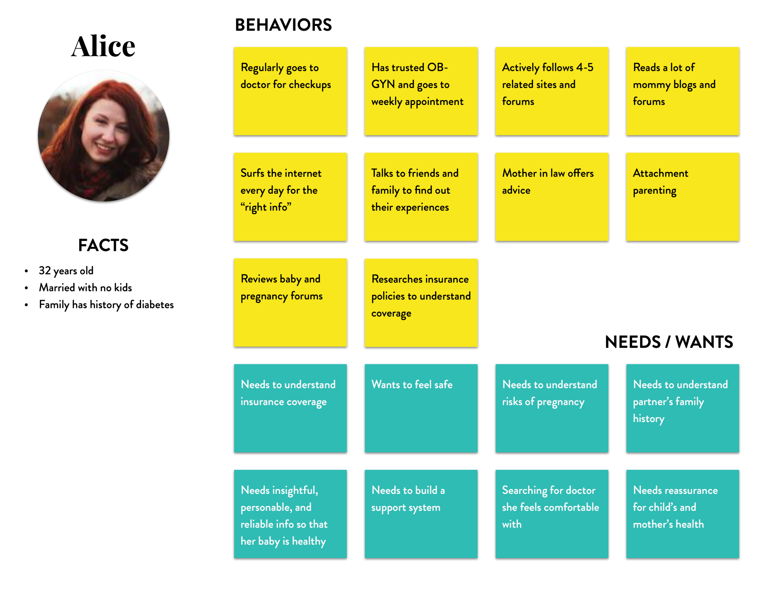
In order to screen for participants in the usability test, we had to develop a good understanding of who Counsyl's customer is. We built a persona to have a conceptual understanding of the users' needs and behaviors.
Our original hypothesis was that users were not clear on the cost and how insurance would be involved. Upon conducting usability tests with five people, we uncovered some common themes:
- Users were not clear on the cost structure
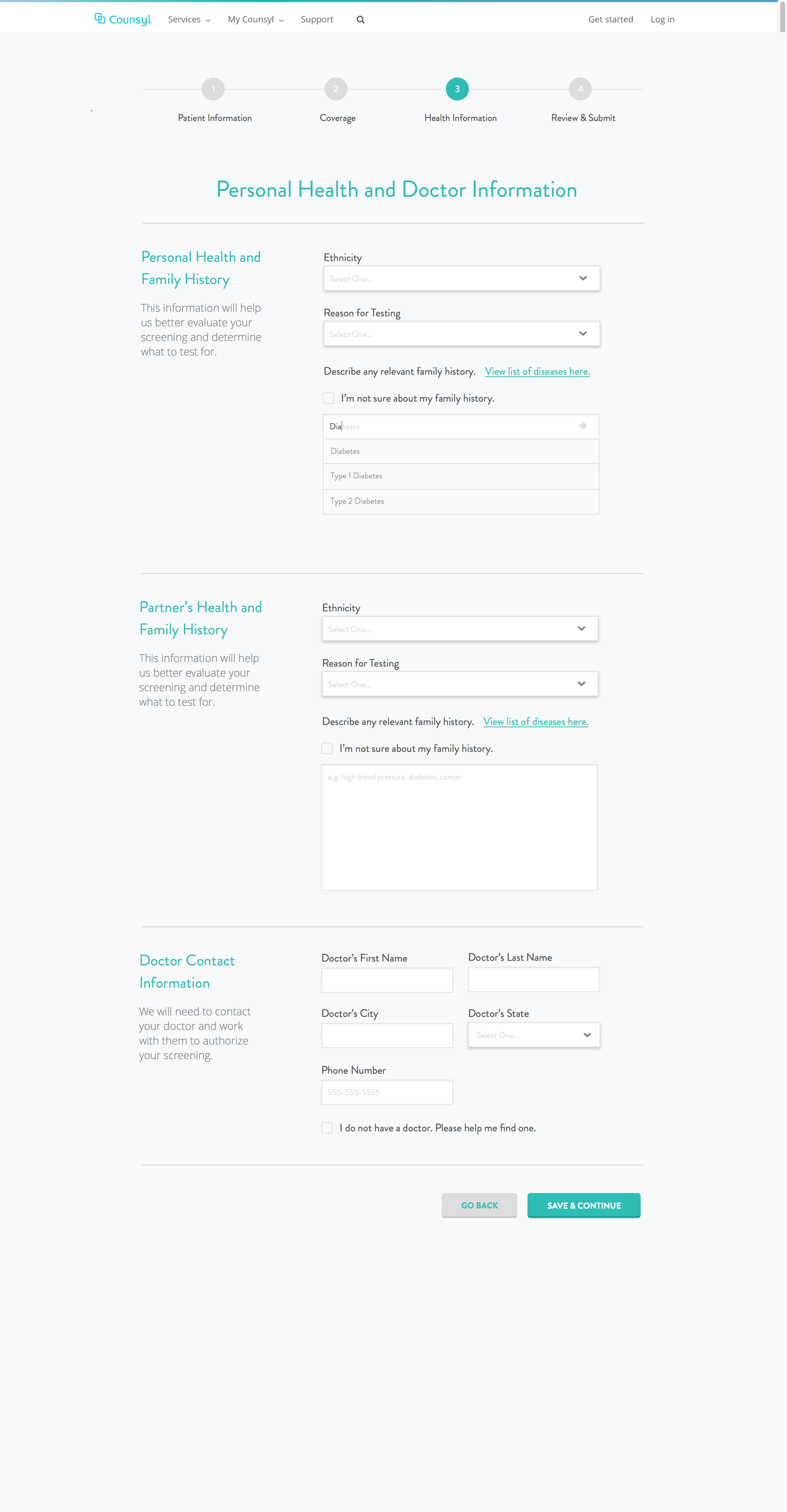
- Users did not understand how their doctor was involved
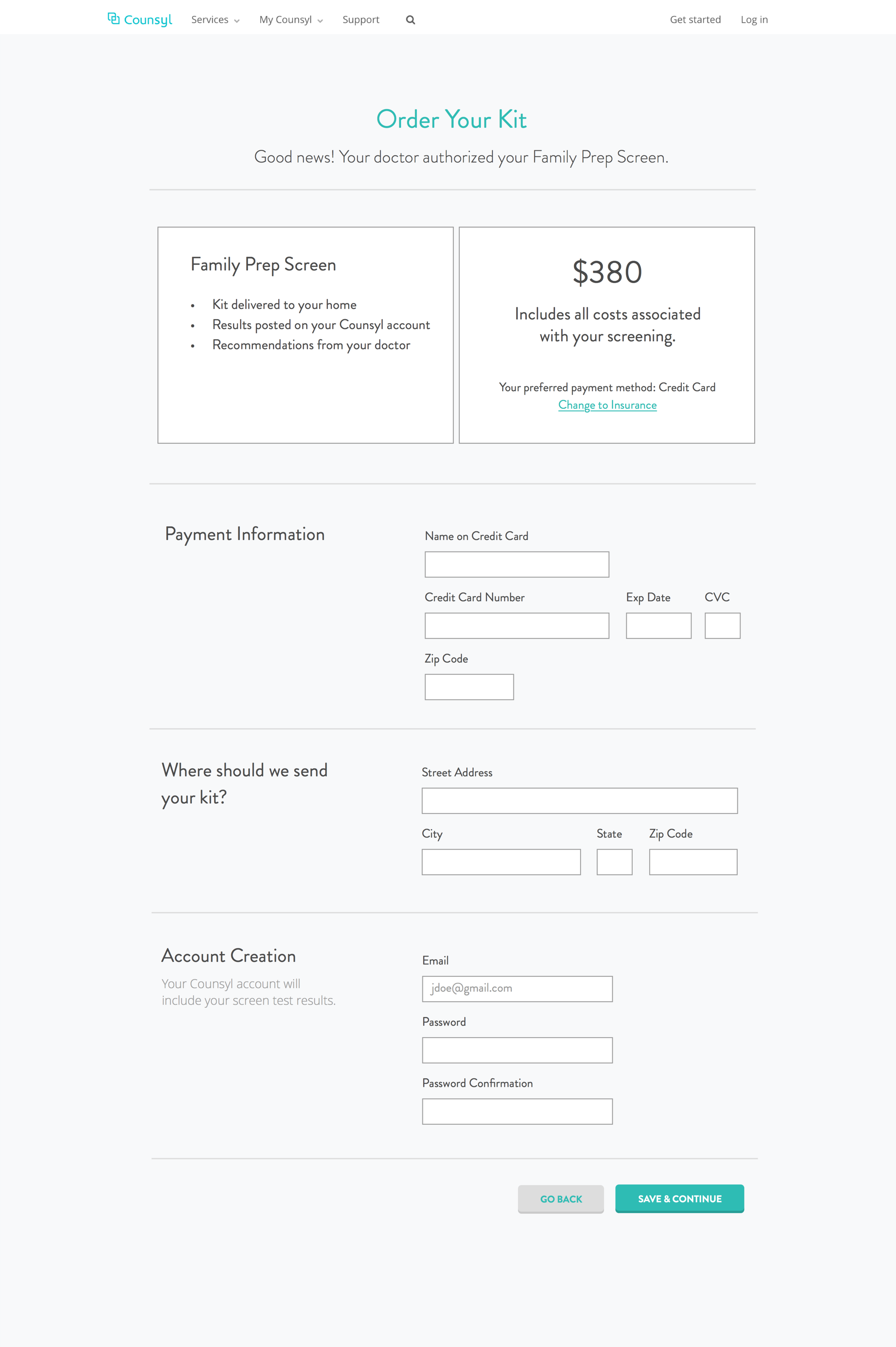
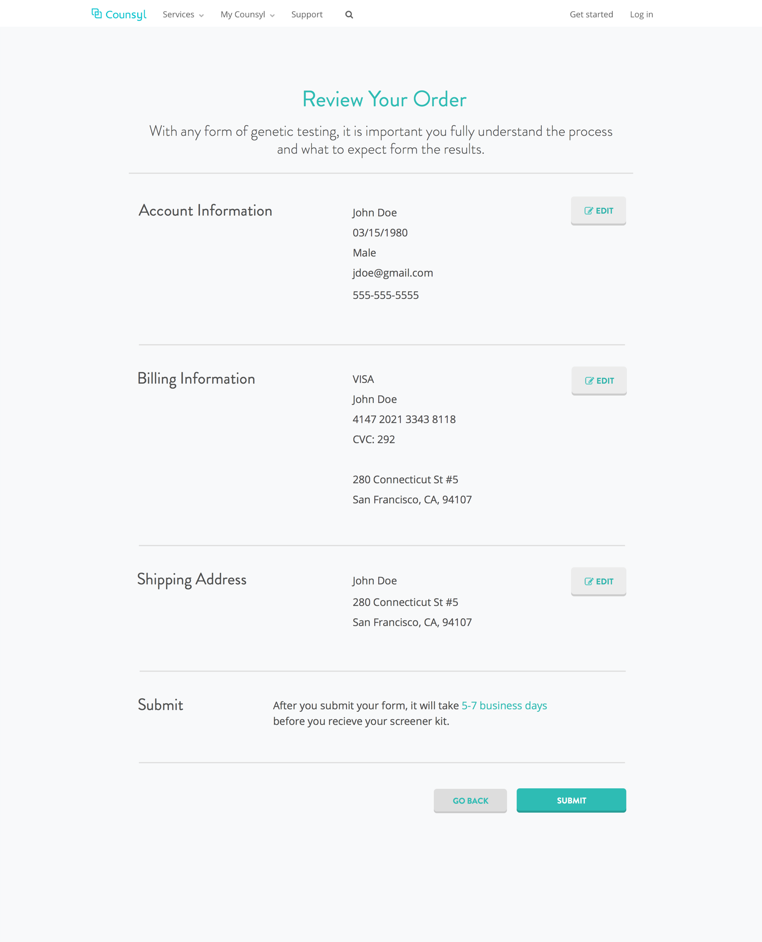
- Users did not know what to expect during the entire process (ordering and post ordering)
“How do I pay with both my credit card and insurance?”
“I didn’t know I have to get my doctor to approve this.”
“I guess they will send me a kit soon, but I’m not really sure.”
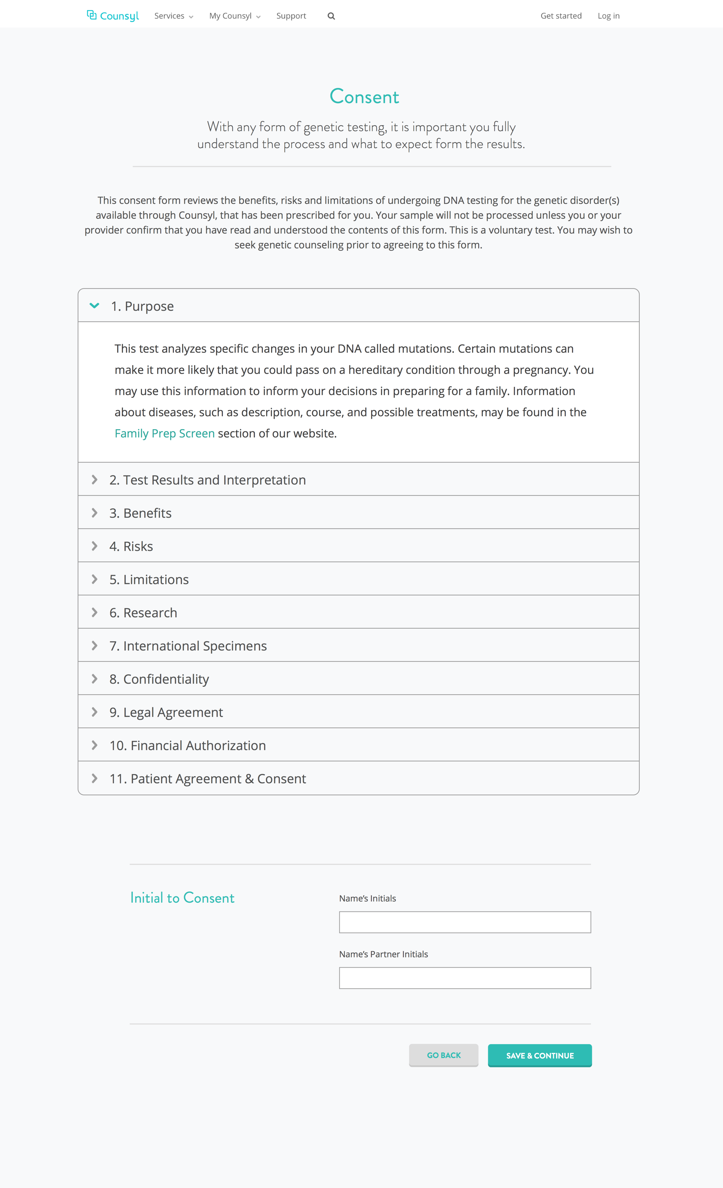
Approach
Key Design Decisions
The insights from the usability tests triggered us to think about solutions to the following design questions:
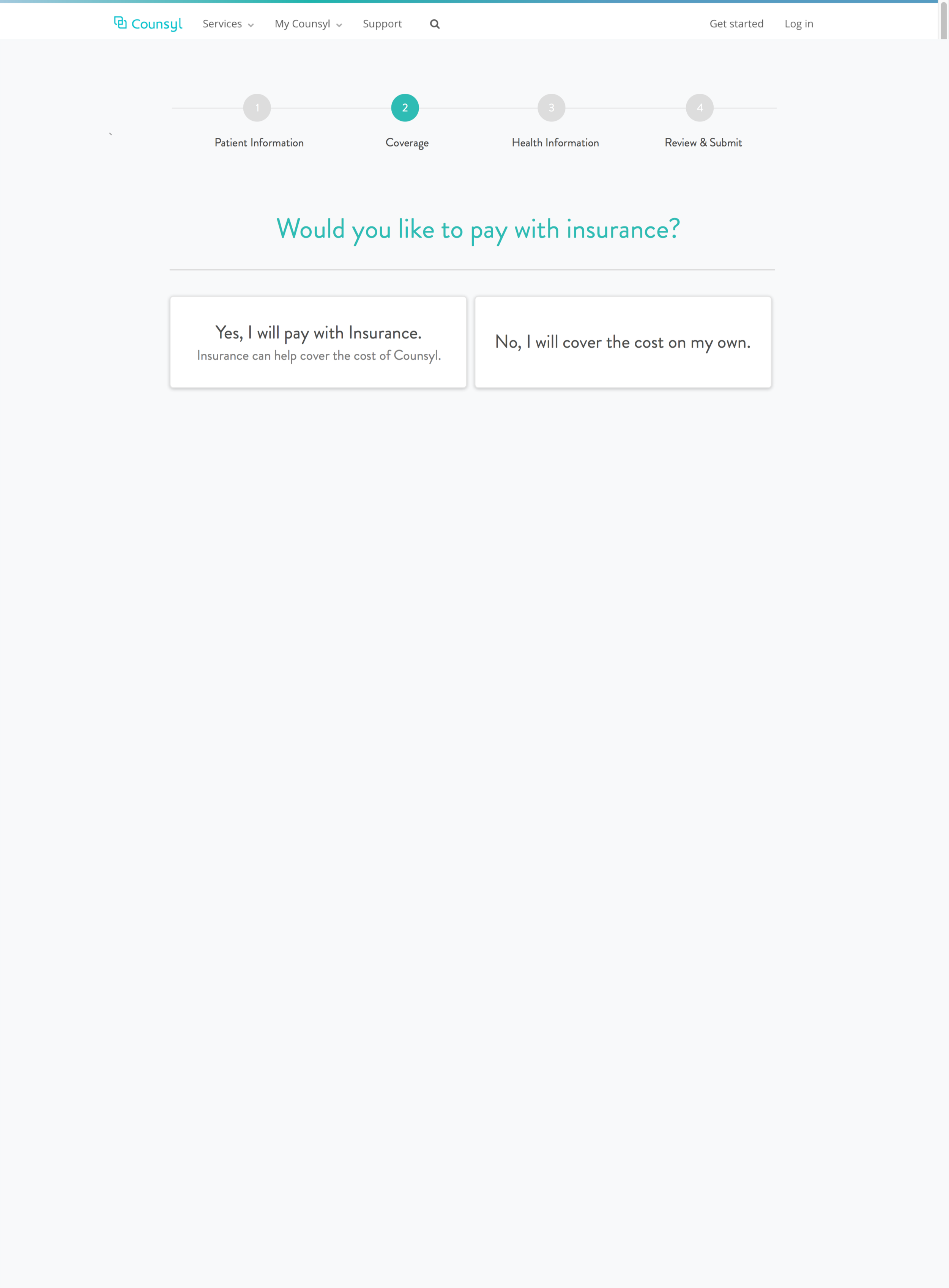
- How might we simplify the process while still maintaining trust?
- How might we increase transparency on the genetic screen price and how payment would be performed?
- How might we provide the user with more guidance on what their entire experience will be like?


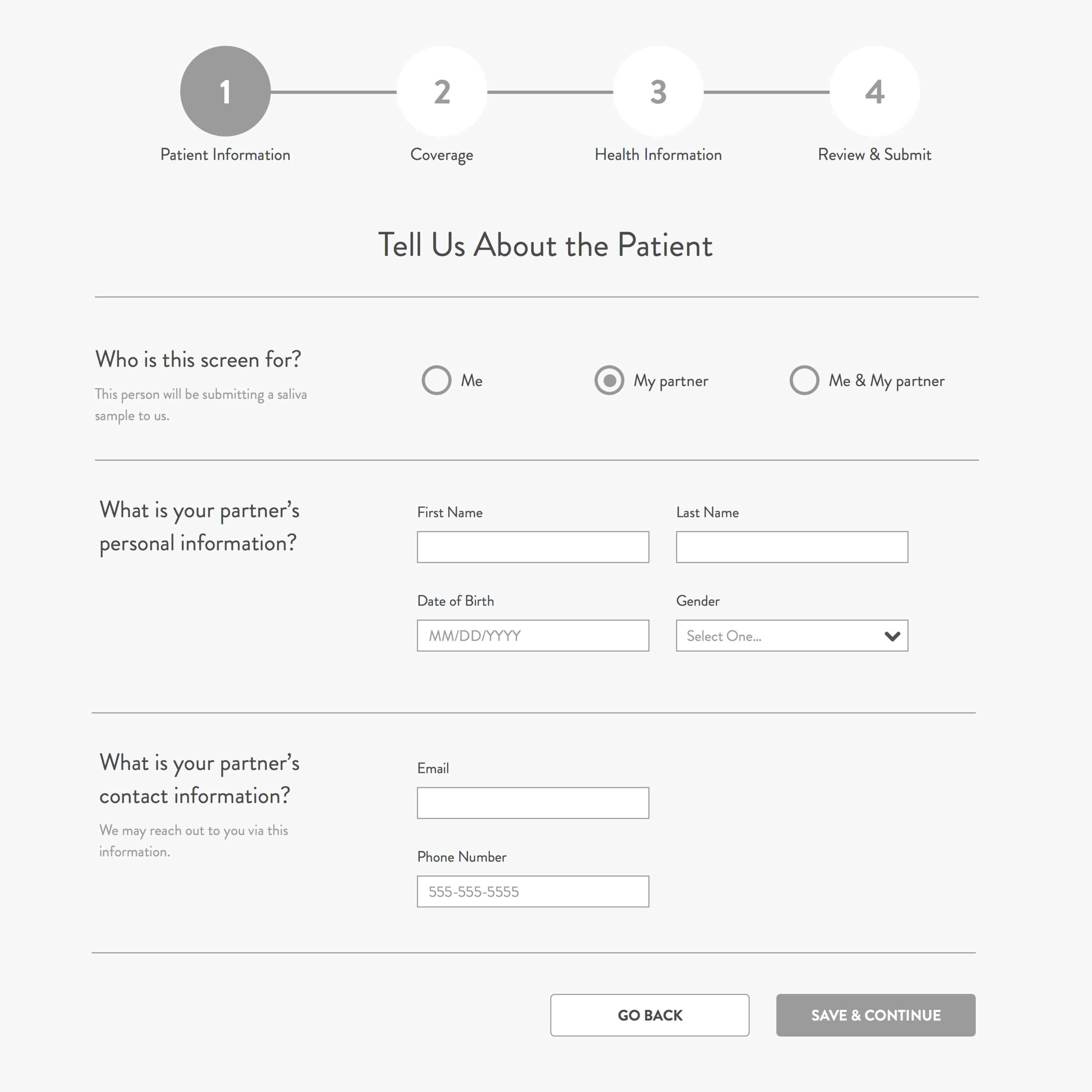
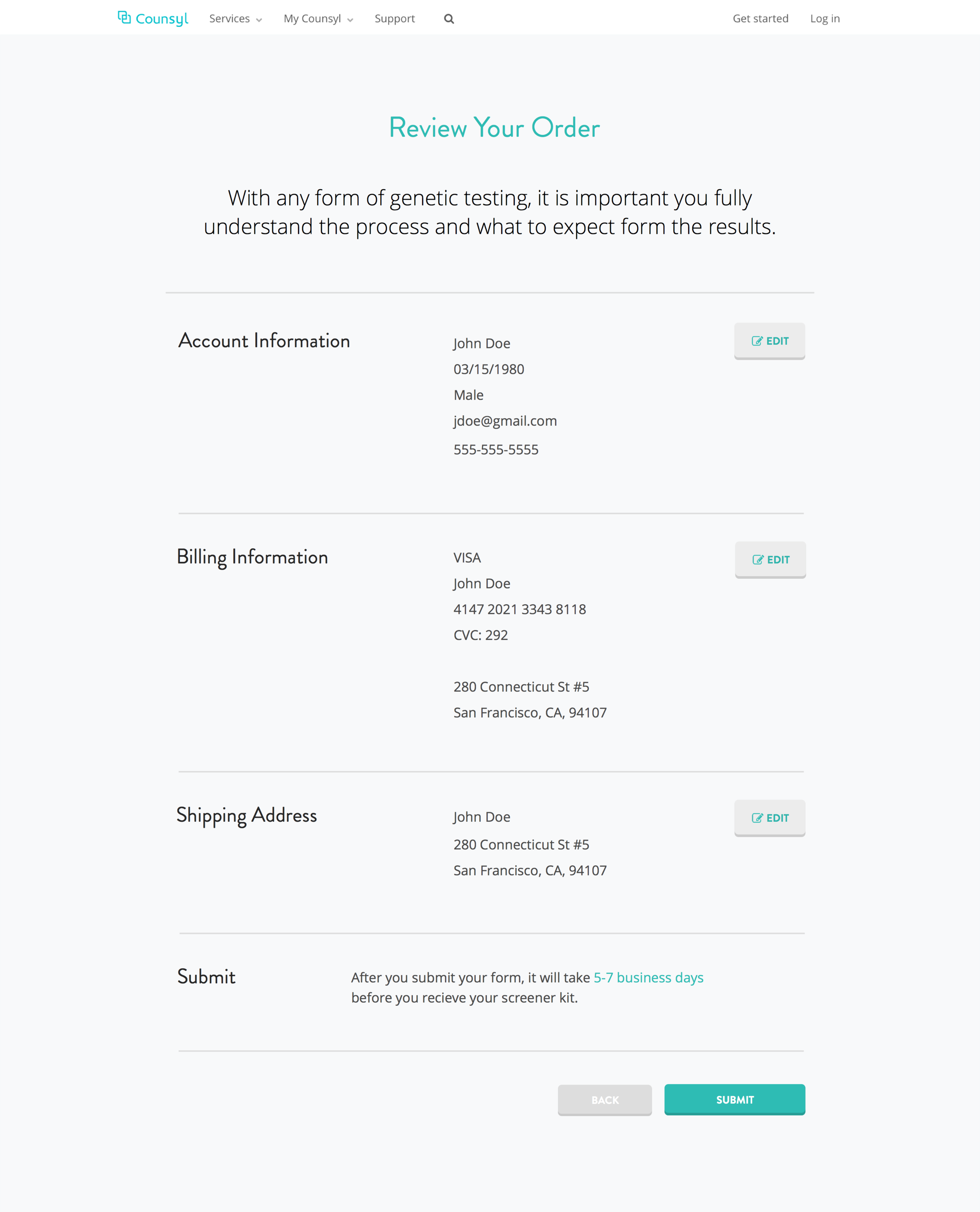
Process Simplification
We broke down the process into "puzzle pieces" and re-arranged them to test different sequences. An interesting consideration was length of the entire process. Based on my interview with Jesse Silver, VP Product at Omada Health, I knew that patients typically like longer forms because it gives the impression of personalization and better care. As a result, we decided not to eliminate any pieces and divide the flow into 2 parts: pre-doctor authorization and post-doctor authorization.

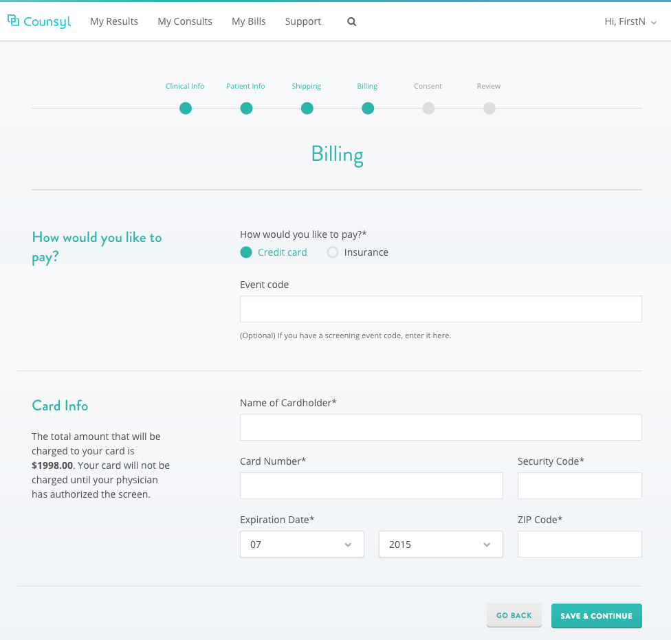
Price Transparency & Payment
We entertained a few ideas like showing an estimated price first or not showing price until post-doctor authorization. In the end, we decided to integrate the existing price estimator from their landing page into the payment page.
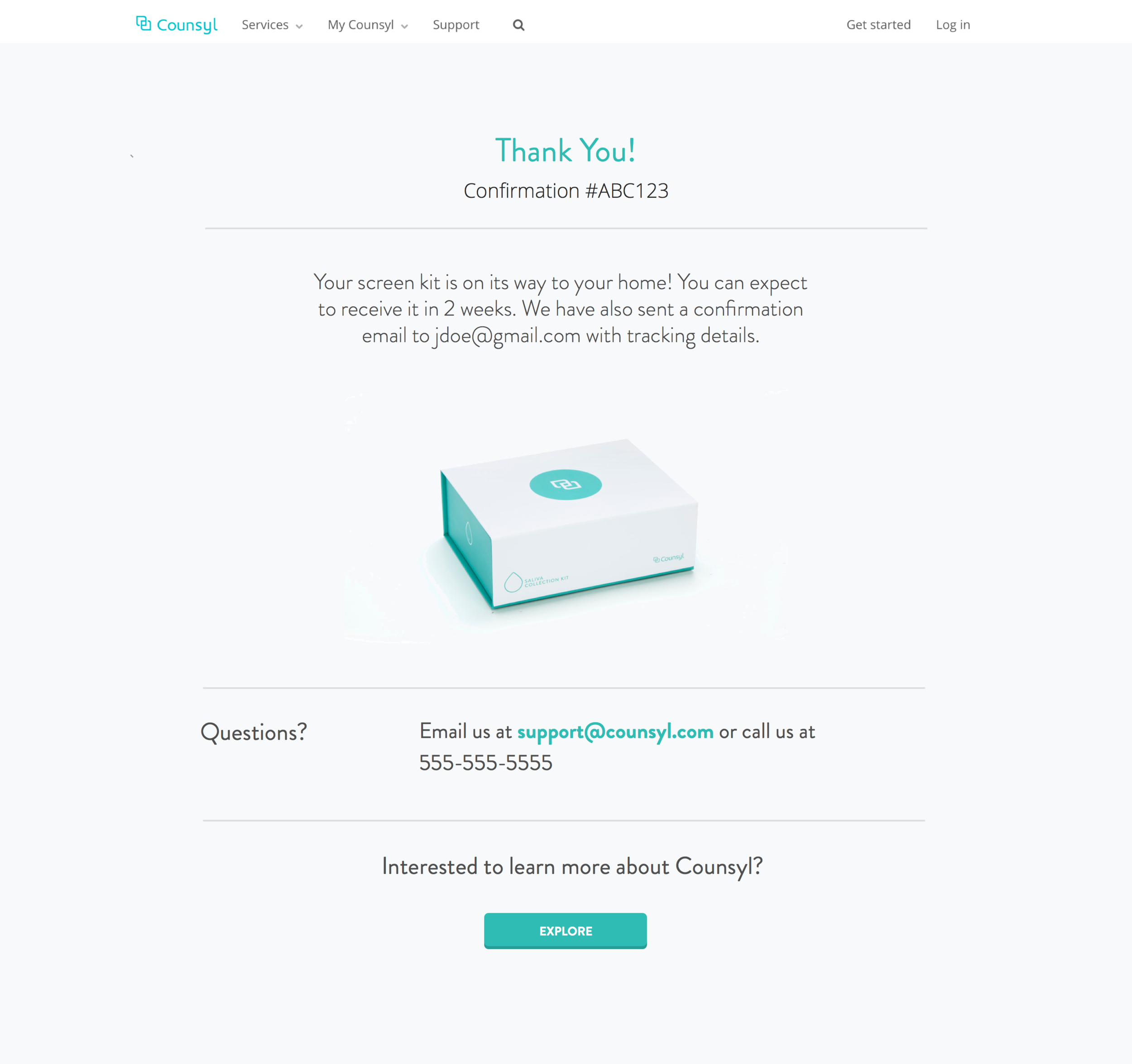
Guidance
We brainstormed different copy content using simple language, and introduced images and default interactions. We also considered how people would be using their mouse or keyboard to complete the form.
Design
Task Flows
One concern with two flows is the potential for users to drop off after the first flow. My hypothesis is that this will not be a problem because users will feel invested in the process having already input family history and doctor information. They will want to finish the process to get the value out of their invested time.
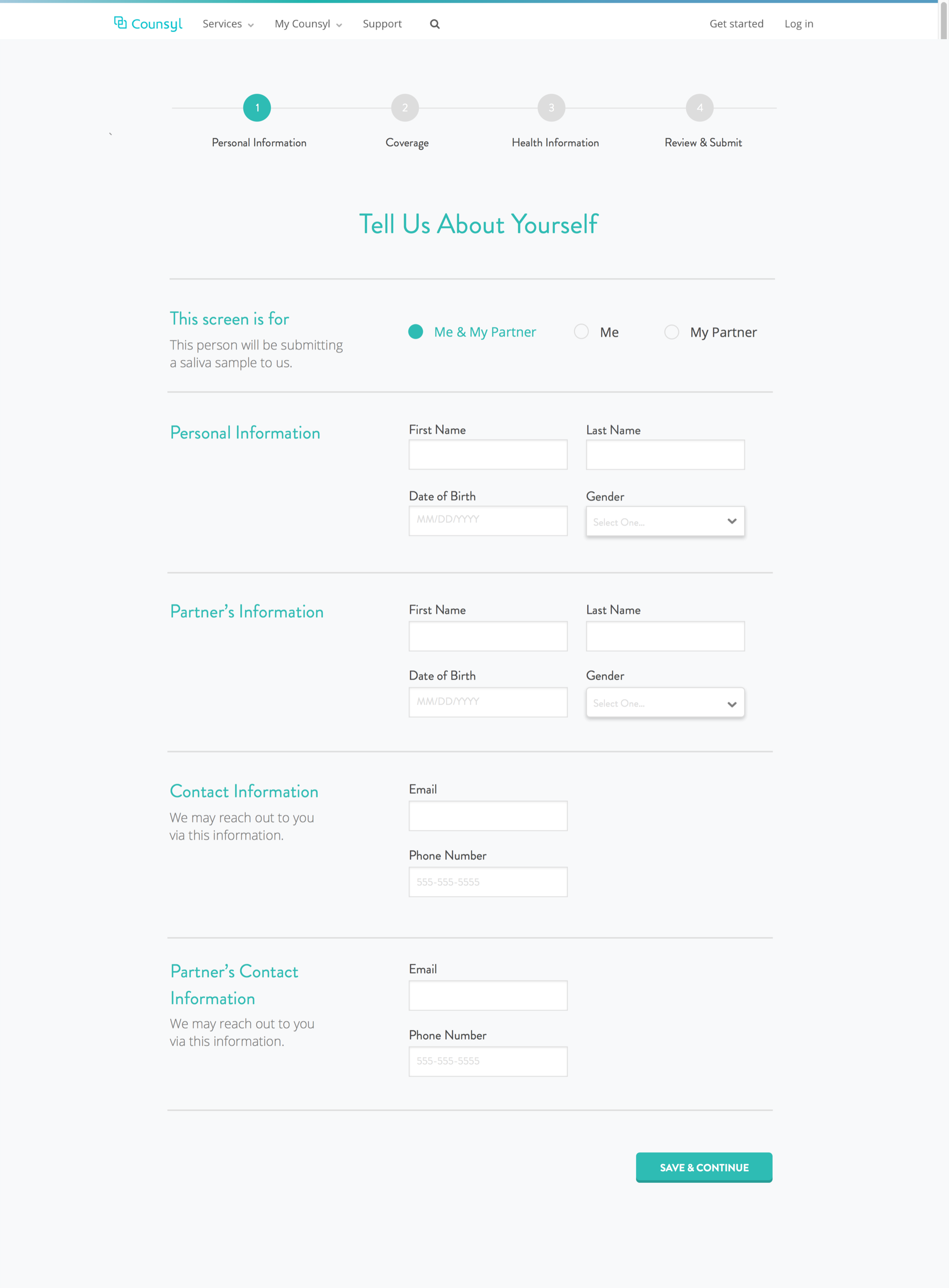
Before
After
Medium Fidelity Prototypes (Select)


I worked on the initial medium-fi prototypes in Sketch and focused on:
- using a grid system
- creating multiple versions of a single page (e.g. single and two-column) to evaluate visual balance
- testing different use cases (e.g. requesting on behalf of just me vs. my partner vs. both individuals)
High fidelity prototypes (Select)
FLOW one


FLOW TWO


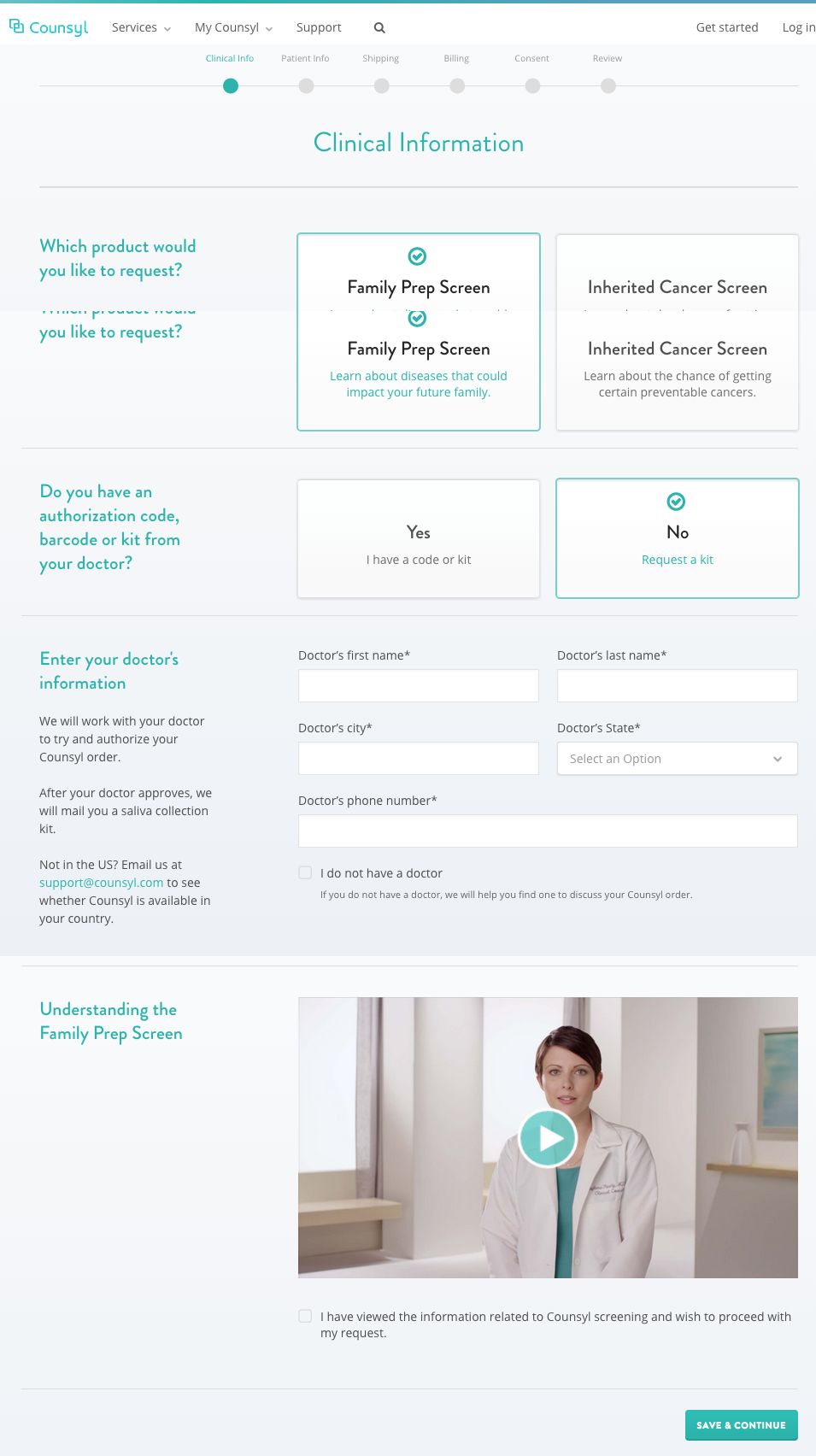
Before & After Prototypes
Before
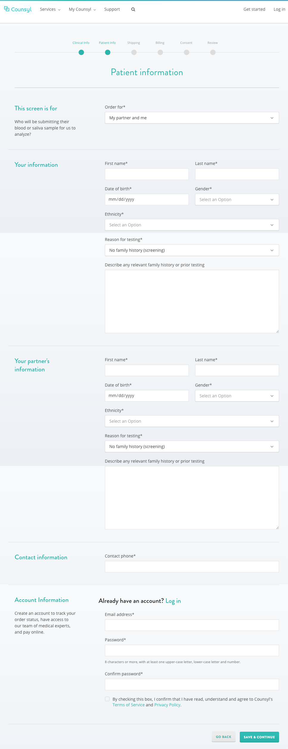
After


![[v1] Thank You.png](https://images.squarespace-cdn.com/content/v1/55680e49e4b0e2f8eac0d829/1446446256979-MKSY84O8F6AE81BO3PNA/%5Bv1%5D+Thank+You.png)
RETROSPECTIVE
Balancing Simplicity & Transparency
Some key takeaways include:
- Price is important when dealing with health - My assumption that people will pay any price to ensure health of their family is not completely true. People have to feel they got value out of the experience.
- Simplification does not necessarily equal reduction - Process flow mapping and design and prioritization of information display can be used to make it easier for users.
- Usability testing refines our understanding of people's behaviors - Qualitative data is key to getting at the "why" of click and order volumes.